Guide to Implementing Light and Dark Modes for Websites
Many users are seeking personalized browsing experiences. Offering the option to switch between light and dark modes has become a necessity for modern web developers. This guide aims to give streamlined practical steps to incorporate light and dark mode functionalities into your website. By implementing this feature, you will enhance the user’s experience and provide a more inclusive and visually appealing web experience.
Getting started
Today’s browsers come equipped with a modern CSS feature called prefers-color-scheme. This feature allows us to detect whether light or dark mode has been enabled in the user’s browser. By utilizing prefers-color-scheme along with CSS media queries, we can seamlessly implement light and dark mode options on our websites.
Here is the current browser support for prefers-color-scheme:
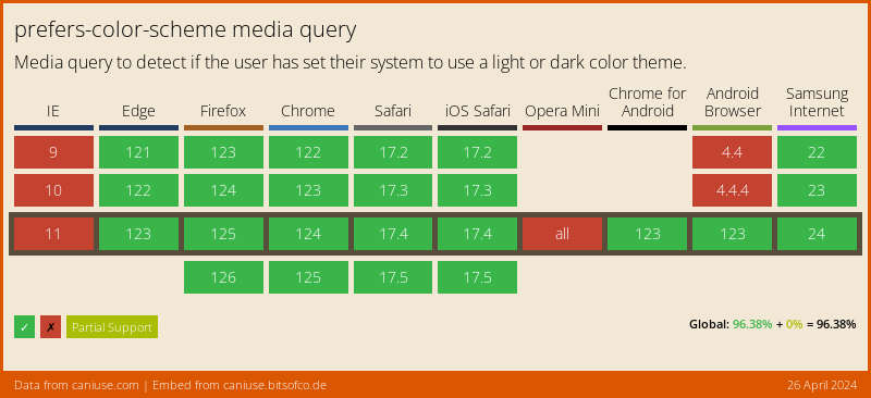 Note: In case your target audience includes users on older browsers that do not support
 prefers-color-scheme, we can still incorporate a manual dark mode toggle. More on that later.
Here is an example of prefers-color-scheme :
See the Pen Guide to Implementing Light and Dark Modes for Websites: Snippet 1 by Kyle Ross (@kylejamesross) on CodePen.
CSS Variables for light and dark themes
While working on the visual style differences between your light and dark themes, it can be beneficial to define these differences using CSS variables. We then place these variables in the :root CSS pseudo-class.
See the Pen Guide to Implementing Light and Dark Modes for Websites: Snippet 2 by Kyle Ross (@kylejamesross) on CodePen.
Toggling between Light and Dark Modes
In order to implement the dark and light themes on our website, we will utilize CSS to distinguish between the two modes. To achieve this, we can utilize the data-theme attribute on the root HTML element.
See the Pen Guide to Implementing Light and Dark Modes for Websites: Snippet 3 by Kyle Ross (@kylejamesross) on CodePen.
Next, we will incorporate JavaScript to handle toggling the data-theme attribute on the root element:
See the Pen Guide to Implementing Light and Dark Modes for Websites: Snippet 3 by Kyle Ross (@kylejamesross) on CodePen.
Persisting the User’s Selected Theme
To ensure that the user’s selected theme persists across pages and visits, we need to store the theme in the browser’s localStorage when it is toggled. Here is the updated code:
See the Pen Guide to Implementing Light and Dark Modes for Websites: Snippet 4 by Kyle Ross (@kylejamesross) on CodePen.
With this updated code, the user’s selected theme will be stored in localStorage when the theme is toggled. When the user visits another page or reloads the page, the selected theme will be applied.
Informing the Browser about System Color Scheme Changes
To inform the browser about the color scheme supported by the current page, you have two options: using a meta tag or the color-scheme CSS property. Here are examples of how to implement both:
Meta Tag:
<meta name="color-scheme" content="light dark">color-scheme Property:
:root { color-scheme: light dark; /* both supported */ }By providing this information to the browser, it can consider the color scheme when rendering user agent-controlled elements.
Conclusion
In conclusion, we have implemented a light and dark mode feature. This allows users to toggle between light and dark modes, enhancing their overall browsing experience. Additionally, we have allowed the adaption of the theme based on the user’s browser settings. Below is the final result:
See the Pen Guide to Implementing Light and Dark Modes for Websites: Snippet 4 by Kyle Ross (@kylejamesross) on CodePen.